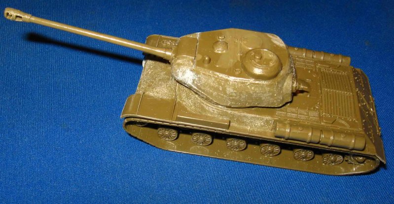
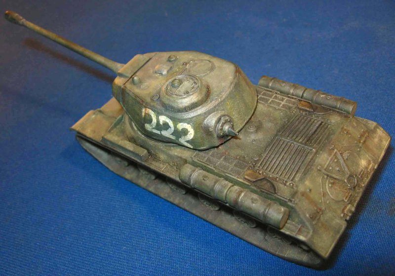
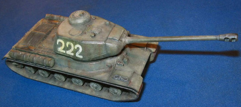
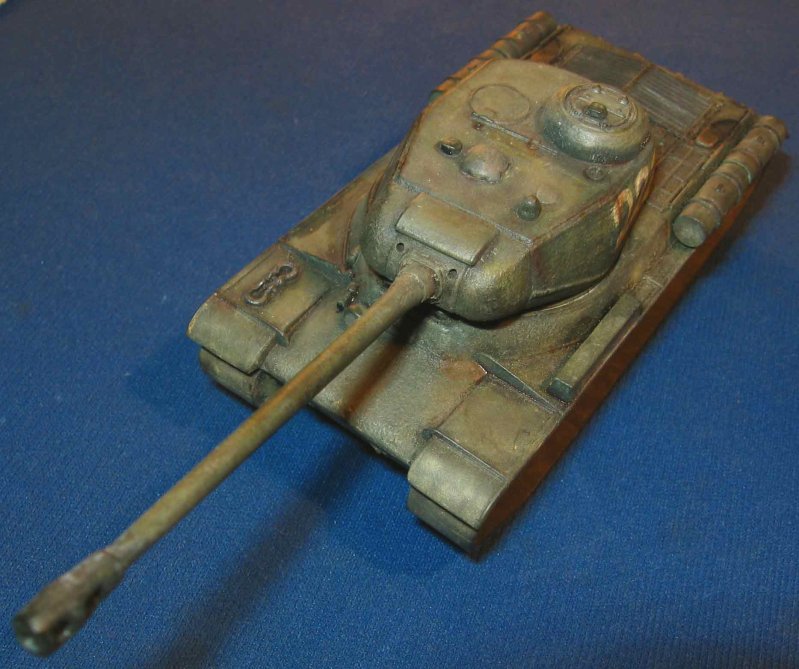
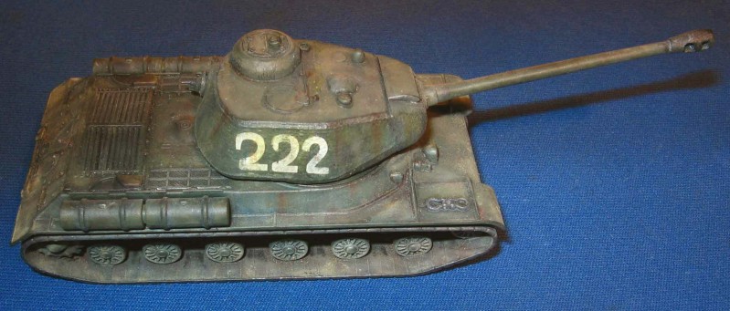
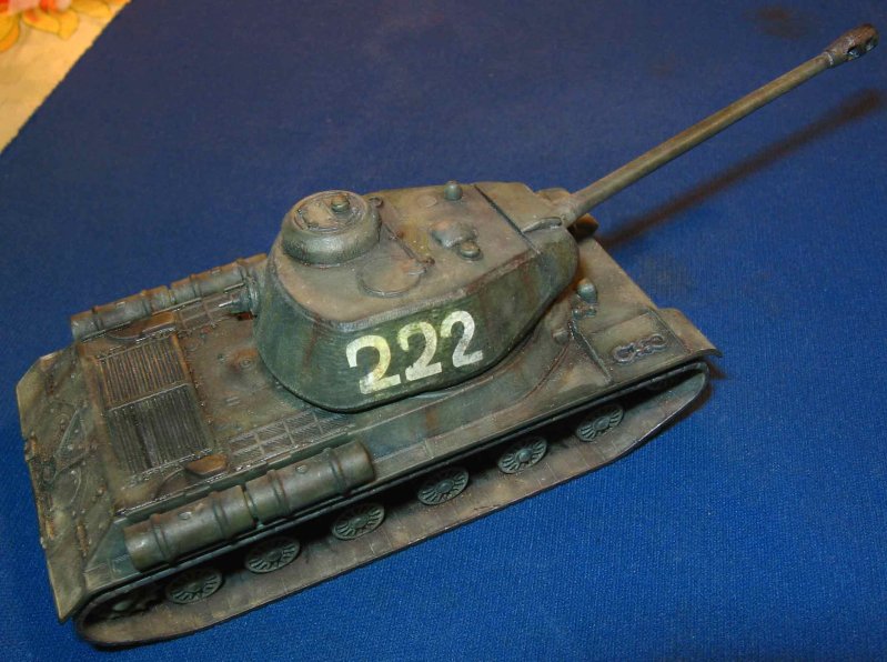
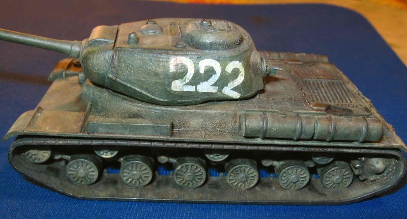
IS-2
Users' choice
This gallery has 1.72% of the users' votes.
By: Nenad Matic
Manufacturer(s): Italeri
Modifications: No modifications, except drilled out muzzle brake and slightly improuved texture on the turet and superstucture
Description: Model depicts 4th Guards Tank Regiment vehicle, summer 1944, Lvov Painted in MM acrilics, weathered with oils and pigments+ graphite pen
- Judge 1
- Large white numbers immediately draw attention when looking at your model. Still, numbers on the left side of the turret are painted uneven (if this unusual insignia is based upon a photo of a real tank, you should have mentioned a reference). Base color of the tank is authentic though it has strange tones in some areas. Though you’ve added a wash, it hasn’t outlined small details; using stronger pin-washes would help to achieve this. To add extra realism to your work I’d advice you to put more dust and dirt on the chassis. The same is true for strains on the fuel drums and fuel spots on the engine deck. As for the strains on the turret and the hull I’m not sure that such rusty colors could exist on an undamaged vehicle.
- Judge 2
- A very popular kit this month and I can see why, the JS-2 is a very imposing vehicle with its heavy armour and long gun. The paint work is a good colour but I find the oil paint fading stage could be more subtle as could the streaks on the turret. The dust is logically placed but gets lost in the finish, changing the colour to make it contrast more with the base colour is more effective and visually interesting. The same can be said for the painted details -exhausts, tow shackles, fuel tanks etc.. With a single coloured vehicle the opportunity to create contrast should always be taken to achieve a visually rich and interesting finish. The turret numbers look great; they have been well applied and blend nicely with the final finish. Toning down the oil paint fading and working on building up more contrast will be time well spent and take your work onto the next level, keep up the good work.
- Judge 3
- Your paintscheme is certainly not lacking in interest, but the overall effect is somewhat confusing as has been noted above. It is difficult to tell what the many shades and tones represent, are they highlights, faded areas or dust? The burned exhausts look quite good, but some of the rust streaking is rather over done and a little coarse. The rear deck of the vehicle would be well served by a series of strong pinwashes to bring out the detail present.